I think you’ll agree with me on this - Google likes to keep us on our toes.
Take last year, for example. In the 12-month period, we’ve seen many major shifts in SERPs. Penguin has become a part of the core algorithm. Google removed right-hand side PPC ads and switched off PageRank. The AMP Project launched, and we learned that RankBrain is one of the top three rankings signals…and that’s still just the tip of the iceberg.
So, as we enter 2017, I thought I’d share with you the 5 biggest changes I believe will affect your rankings and user experience this year.
#1. Mobile-First Index Taking Over
To say that 2017 is the year of mobile is some serious understatement. After all, almost every major change the search engine had introduced in the last year or so was relevant to mobile user experience. When it comes to the upcoming changes, the biggest of them, of course, is the mobile-first index.
Much has been said among the SEO community about the new index already. I wrote about it a couple of times too (if you’ve missed those posts, you can read them here and here). And needless to say, the mobile-first index is going to impact your work in many ways.
For one, the new index swaps the search engine’s current setup around.

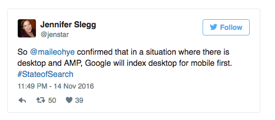
Instead of showing desktop results to mobile users, it will display mobile results. It will also evaluate your content based on the mobile version of the page. This is serious news for any website having two different versions - mobile and desktop. Also, the new index will also ignore AMPs, unless they’re created based on your mobile pages.

But launching the mobile-first index isn’t the only way Google focuses on mobile. As I mentioned already, the majority of updates and changes that we’ll see in 2017 relate to the mobile user experience. The upcoming pop-up crackdown and AMPs are other examples that prove that the focus will be on mobile.
#2. New HTTPs Warning Label in Chrome
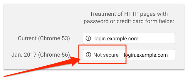
Soon, Google Chrome will begin warning users when they attempt to enter sensitive details, i.e. credit card information or passwords, on sites that aren't protected by an HTTPS encryption. Naturally, the browser will not restrict anyone from entering their data. However, the significance of the warning will most likely deter many users from completing their action.
Here’s how the label will look in practice. Note: you’ll see it after you update to the upcoming Chrome 56 - unreleased yet, at the time of writing.

This change comes as the next step in, what Emily Schechter calls in the official Google’s announcement, “a long-term plan to mark all HTTP sites as non-secure.”
But why the new label? After all, Chrome already displays a neutral warning icon to denote non-HTTPS pages.
Schachter explains:
“Studies show that users do not perceive the lack of a “secure” icon as a warning, but also that users become blind to warnings that occur too frequently.”
The new label isn’t the first action Google has taken to propagate the use of HTTPS encryption on websites. In 2014, it incorporated HTTPS as a ranking signal, giving secure sites a boost in rankings. And come to think about it, given Google’s shift from search to user focus, the upcoming change also makes sense.
Pushing websites to migrate to HTTPS encryption increases security, provides data integrity and ensures authentication across the Internet. In other words, with HTTPS you can rest assured that the server you connect to when logging to a member area, for instance, belongs to the company you’re dealing with. The increased pressure on security will eventually force webmasters to move to HTTPS, and that's regardless of whether their website requires a visitor to submit any sensitive data.
If you’re considering moving to HTTPS, seoClarity can help make that transition go smoothly by identifying the errors that occurred during that transition. The platform reveals which pages are still listed as HTTP, can run a crawl to make sure that all rel=canonical tags have been changed to HTTPS URLs, and monitors improvements in visibility for the pages that have been converted successfully to HTTPS.
#3. Penalizing Websites that Display Intrusive Pop-ups
There’s an ongoing debate about pop-ups or interstitial pages - messages that appear on screen, overlying the content.
On the one hand, marketers agree that they disrupt the user experience. On the other, they admit that with high conversion rates, popups are the most effective lead capture strategy.
(Here are some example conversion rates from Brian Dean to prove it. You can also read more about his pop-up strategy here.)

However, as Google points (note, the emphasis in bold is mine):
Although the majority of pages now have text and content on the page that is readable without zooming, we’ve recently seen many examples where these pages show intrusive interstitial's to users. While the underlying content is present on the page and available to be indexed by Google, content may be visually obscured by an interstitial. This can frustrate users because they are unable to easily access the content that they were expecting when they tapped on the search result.”
And so, as of this month, the search engine will start penalizing websites using disruptive pop-ups on mobile.
How to Tell If Your Pop-up is Disruptive?
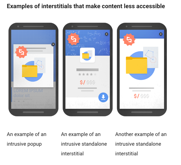
Take a look at the below graphic (via Google). If your pop-up on mobile falls into any of those three categories, displaying it might cause your pages to lose their rankings.

What Can You Do to Avoid the Penalty?
Naturally, the simplest answer would be to stop displaying interstitial pages on mobile pages. However, the cost of sales and conversions might be too great. Luckily, there’s another way. Amend your pop-ups, so they don’t cover the major portion of the screen. Although Google hasn’t revealed what it would consider an acceptable size of a pop-up, various experts predict that as long as the interstitial leaves 70% of the screen visible, you should be okay.
#4. Increased Focus on Mobile Page Speed
A couple of months ago, when speaking about the AMP Project, I wrote:
“[...] consuming content on mobile devices often brings back memories of the gold, old phone modems and dial-up access times, doesn’t it?”
And I’m sure you’ll agree, in many aspects, smartphones offer a rather frustrating user experience. Pages fail to load, various scripts crash your mobile browser, and so on. But a lot of it boils down to a single aspect - speed. Users want to access content on their smartphones quicker, yet often, that experience is plagued by long waiting times.
To combat this problem, companies like Google, Wordpress.com, Twitter and many others devised the Accelerated Mobile Pages Project (AMP for short), undoubtedly one of the most fascinating web initiatives recently. The goal of the AMP Project is simple - to allow creating web pages that render incredibly fast on a mobile. In technical terms, AMP relies on creating a duplicate, lightweight version of a page, using a simplified version of the HTML markup optimized for fast mobile display.
But the key aspect of AMPs is that it puts a new emphasis on mobile page speed. AMP pages shift focus from visuals, page design, and functionality to providing a faster experience. As a result, users will expect an even faster page load times, in spite of page being an AMP or just a standard page. Therefore, monitoring and improving the mobile page speed will become a major aspect of on-page optimization moving forward.
There are many options to monitor and track page speed. Google provides insights for individual pages through their PageSpeed testing tool. seoClarity offers the ability to test page speed in bulk and store all data overtime so you have visibility to before and after analysis. This allows you to provide insights to your team based on Google's suggestions and how that benefited your users' mobile experience. Learn more about how seoClarity helps you optimize for mobile.
#5. Trouble with Optimizing the AngularJS
AngularJS rose to popularity as a framework for web apps, simplifying the process of building an app. As Bill Hunt admitted during our AngularJS webinar (read the recap here), over 400,000 websites use it or its variant. The aspect of AngularJS that speaks to SEOs is its ability to serve fast loading content, improving the page speed time.
Recommended Reading: Optimize AngularJS SEO for Crawling and Indexing
The problem? AngularJS often causes problems with indexing pages built with the framework.
As Keith Goode pointed out:
Improperly implemented, this technology (just like Flash in the past) could make the content on a page uncrawlable, thereby affecting the page’s search visibility.”
But does that mean that we should avoid Angular, and what goes with it, the ability to increase page speed? No, of course not. But we should ensure that moving forward; development teams implement Angular in a way that does not impede rankings and search visibility. I admit, the concept of optimizing the Angular page is a topic of its own. But to share at least some initial wisdom, let me quote Allotment Digital:
“The things that Google can’t handle within AngularJS single page apps are the same things that Google can’t handle on regular flat html pages. Follow some common sense guidelines.”
Fact: Google likes to keep us on our toes. And changes I mentioned above, plus the ones we don’t know about yet, will certainly make 2017 a great year for SEOs. What upcoming changes or new industry developments do you think will affect SEO, rankings and user experience this year? Let us know in the comments below.
Want to learn more about how seoClarity helps companies with their overall content strategy, mobile optimization, and overall search visibility? Explore the platform >


Comments
Currently, there are no comments. Be the first to post one!